SUSHISIDE
Art Direction
Website
Stationery
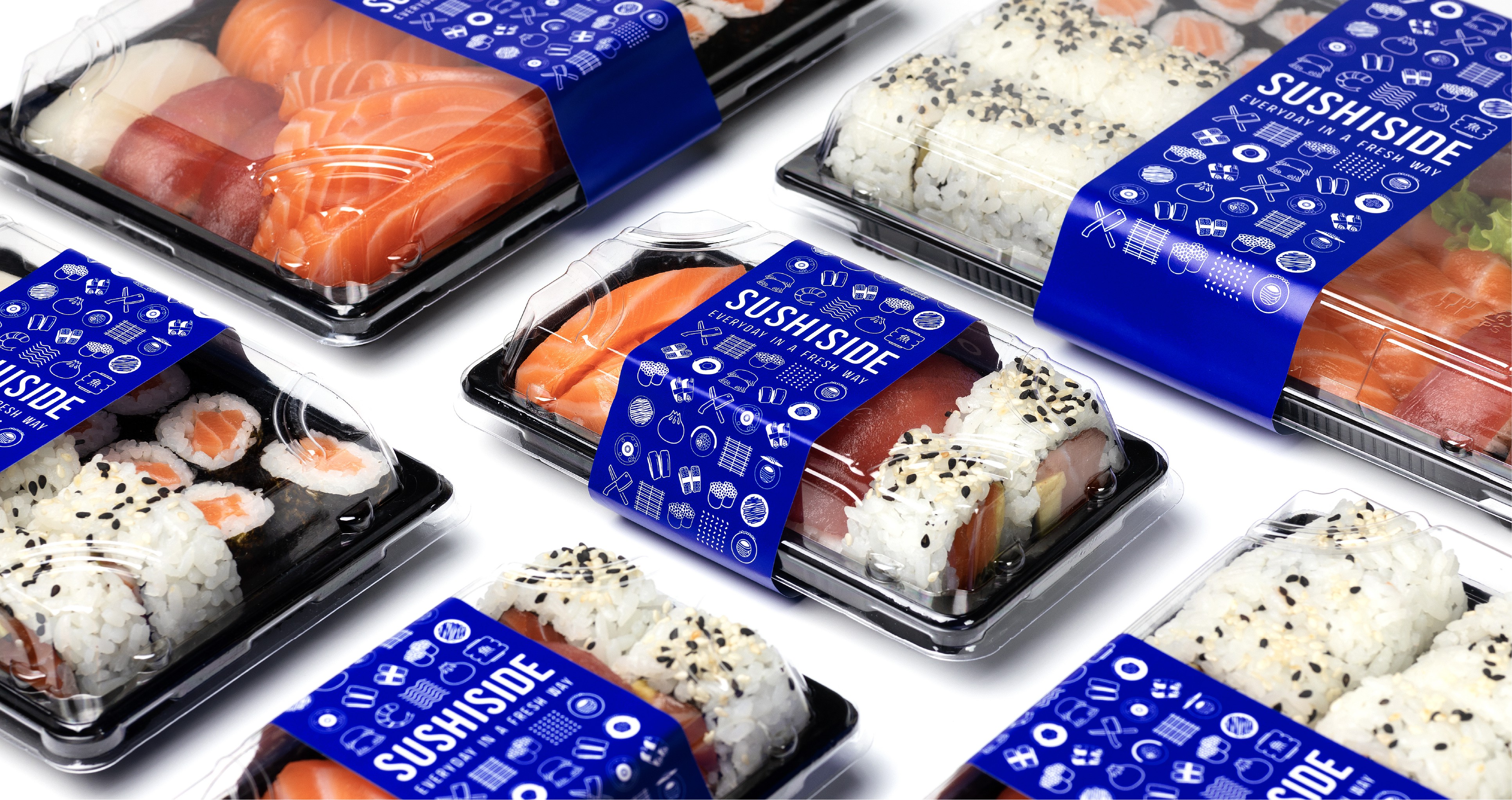
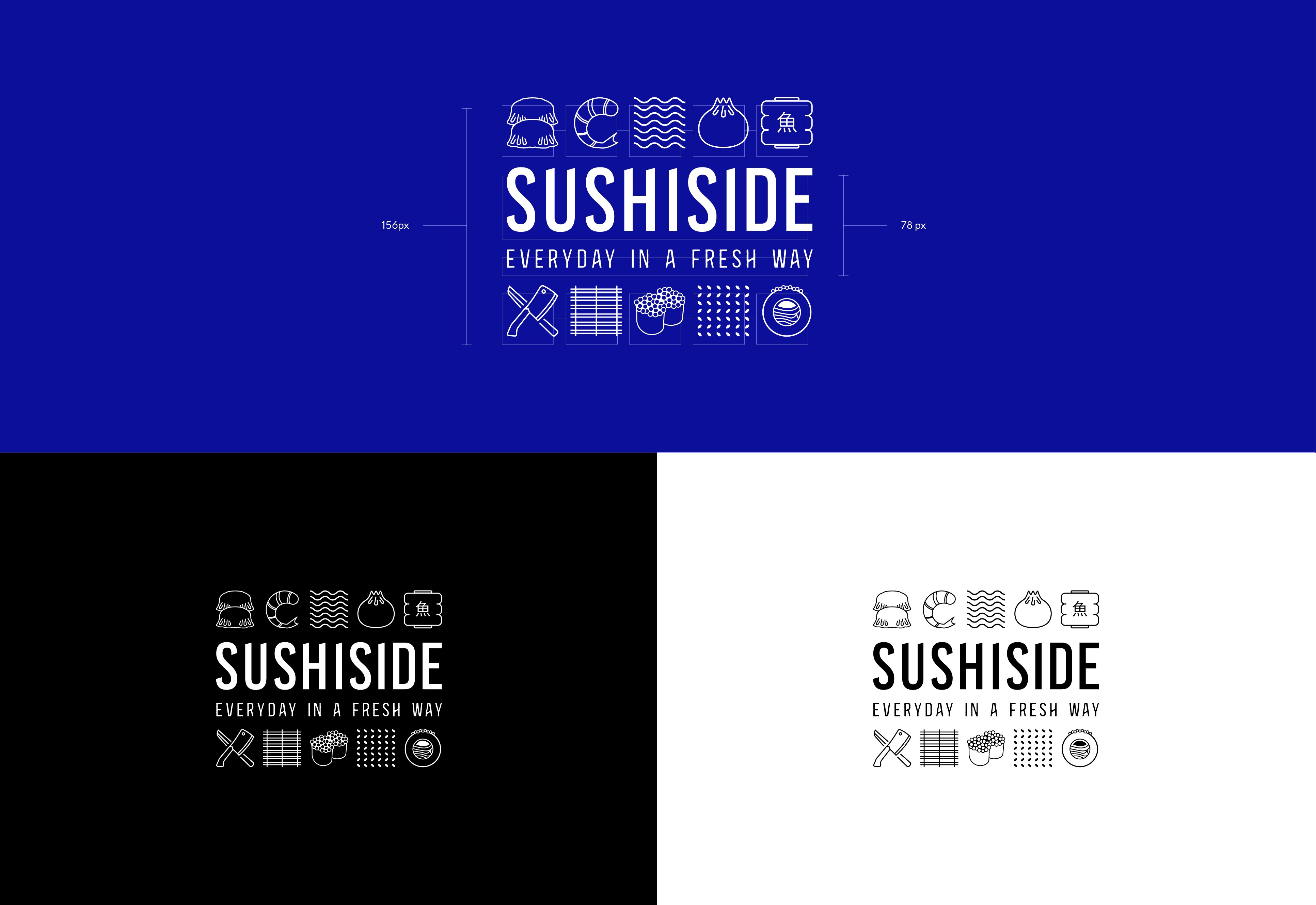
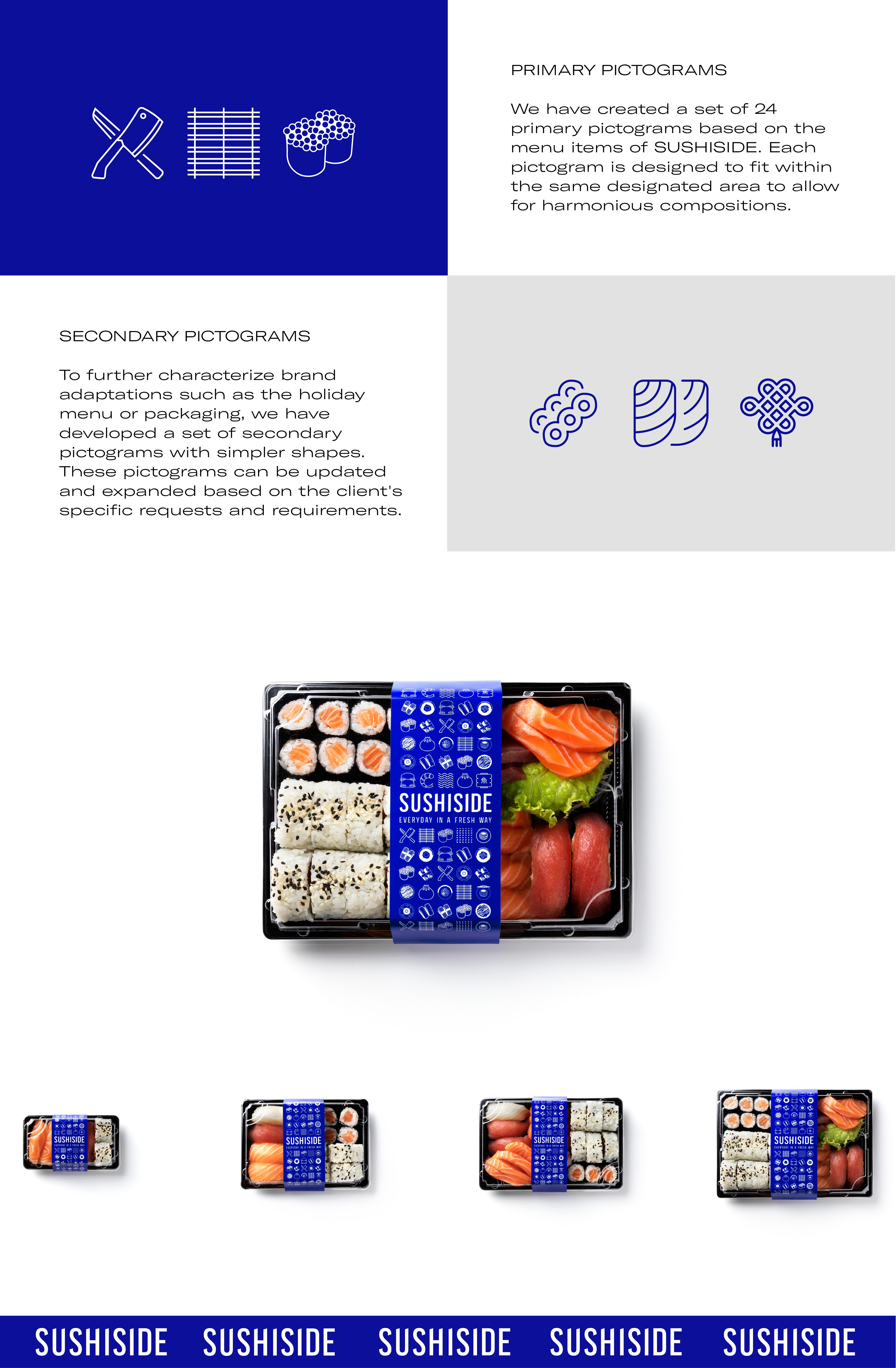
SUSHISIDE, a chain of restaurant-retail points that combines bars, kitchens, and fresh Japanese and Chinese cuisine markets, had to rebuild its brand from scratch.
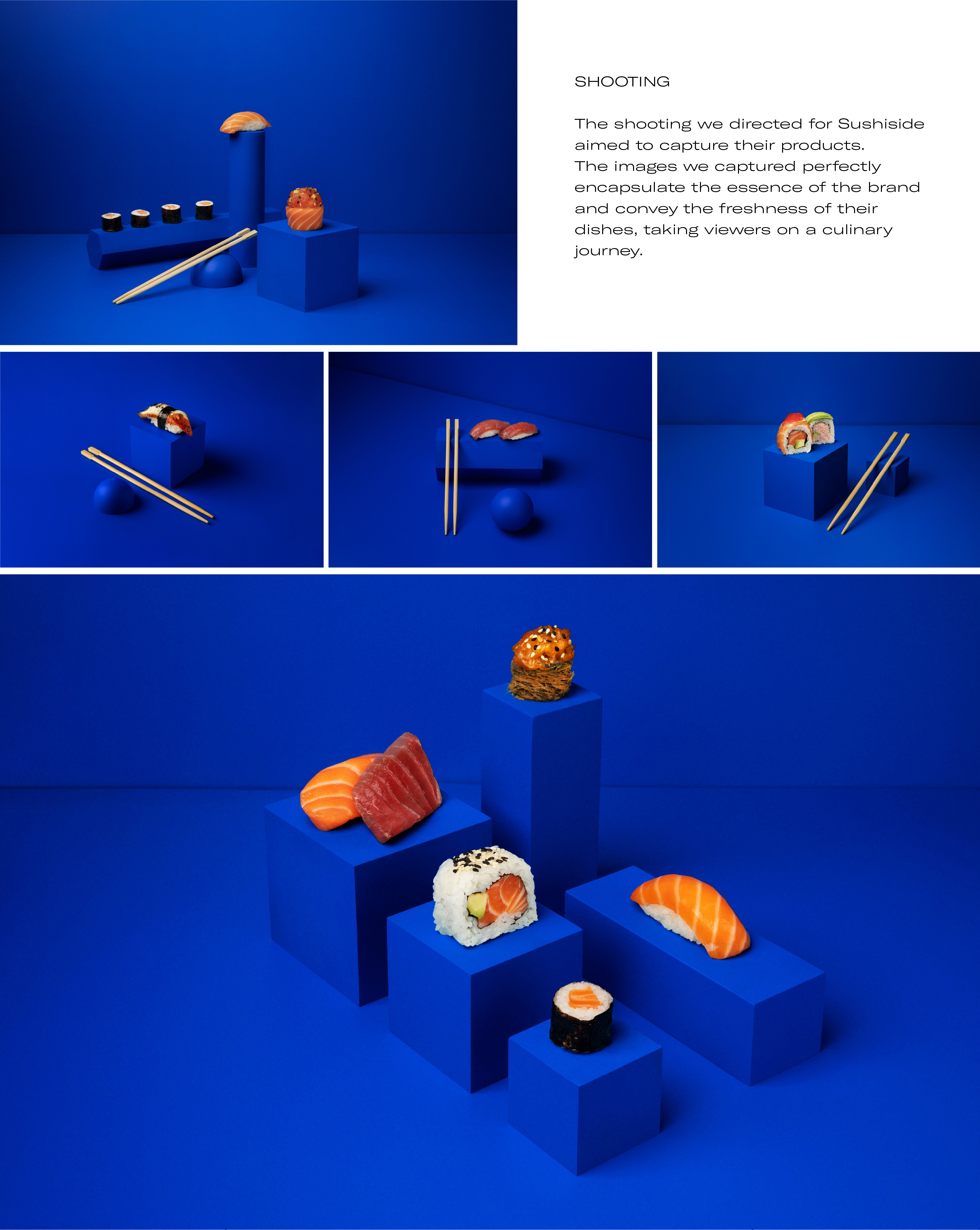
We have given the brand a unique, youthful and versatile character, with the aim of differentiating their products from those of the competition already present in local supermarkets.
COLOR PALETTE
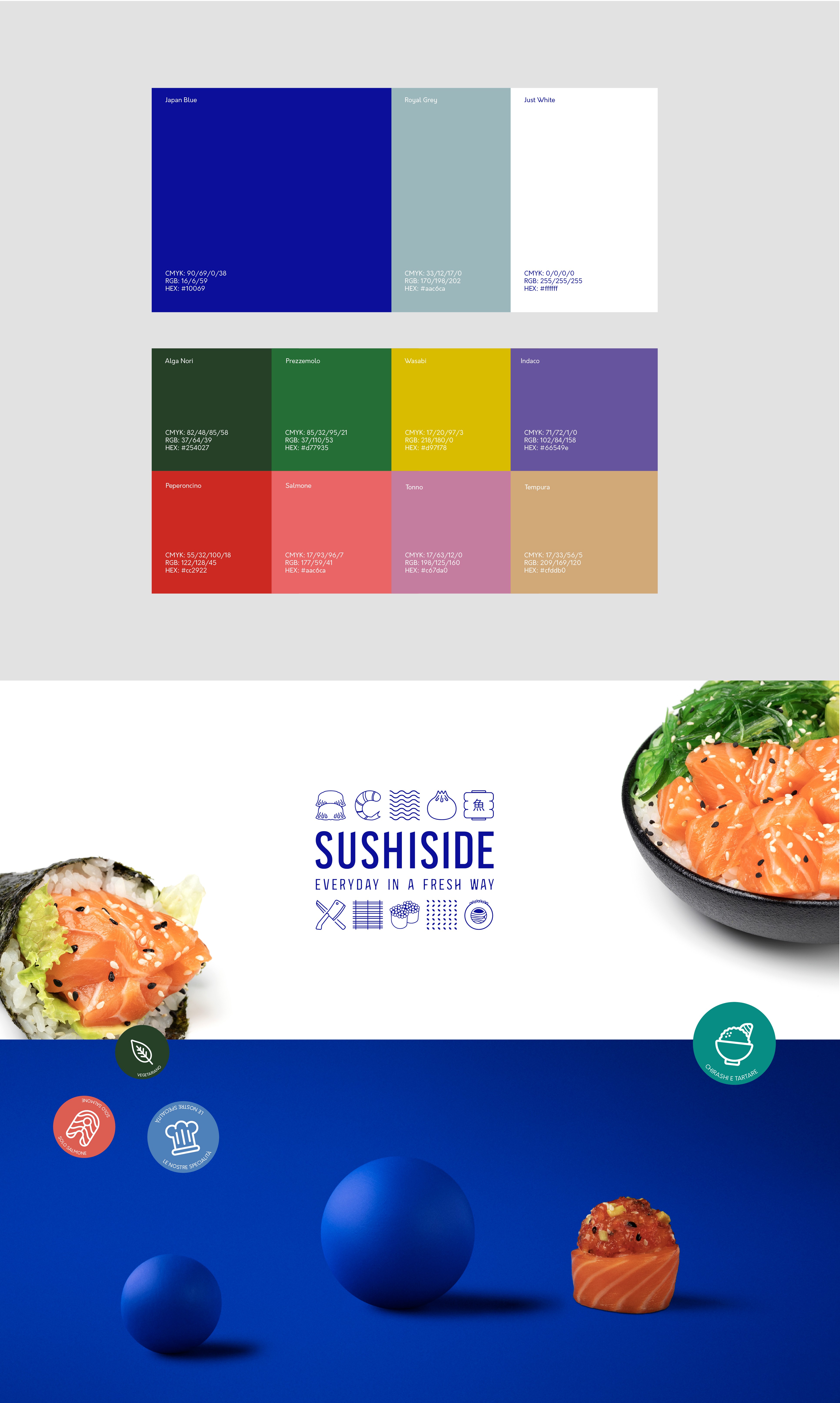
After researching the customs and traditions of Japanese culture, we have created a primary color palette consisting of deep blue, cool gray and white.
We made this choice with the aim of enhancing the packaging compared to the articles of competitors. In harmony with these colors, we have identified a secondary palette for allergens and communication materials.
TYPOGRAPHY
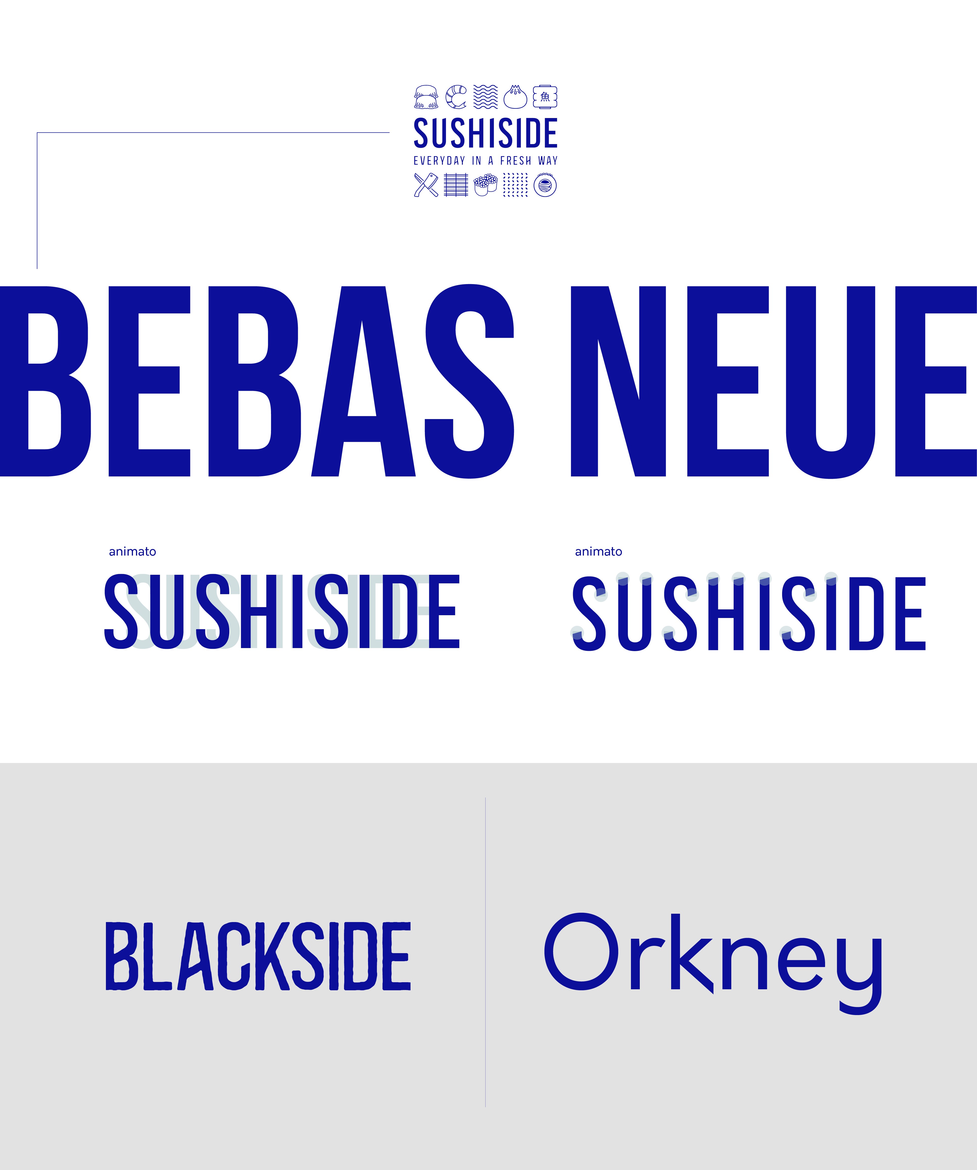
The main font used is Bebas Neue. To give it a distinctive touch without compromising readability, we have applied optical adjustments to the letter spacing. Additionally, we have incorporated a 16.5° slant to the terminals of the letters "S", "U", "H" and "I" to echo the shape of the blade used in fish preparation.
As for the brand's tagline, we have chosen the font Blackside, a sans-serif typeface characterized by a textured and irregular stroke. This font was selected to capture the manual and artisanal aspect of sushi preparation in the logo. Lastly, for the body text, we have opted for Orkney, a geometric sans-serif font with rounded features. It is highly legible and works well at reduced sizes, whether in print or on screen.

ART DIRECTOR ← VINCENZO ALFIDI
PHOTOGRAPHER ← TOMMASO CARFORA
GRAPHIC DESIGNER ← MATTEO GIAMPETRUZZI